Platform
Mobile App
My Role/Tasks
Product Designer
Overview
Shortly after joining the EveryDollar product team, user calls, support tickets, and Mixpanel behavioral data all started pointing to the same problem. Users were getting stuck and couldn't find help. Rather than assuming the help content itself was the issue, I dug into where the drop-off was actually happening. The data pointed to a navigation problem, not a content one.
Working closely with my product manager and tech lead, I redesigned the navigation entry point that was sending users in the wrong direction. It was a focused, well-scoped fix that shipped quickly and delivered a measurable result.
User Pain Points
Help was hard to find
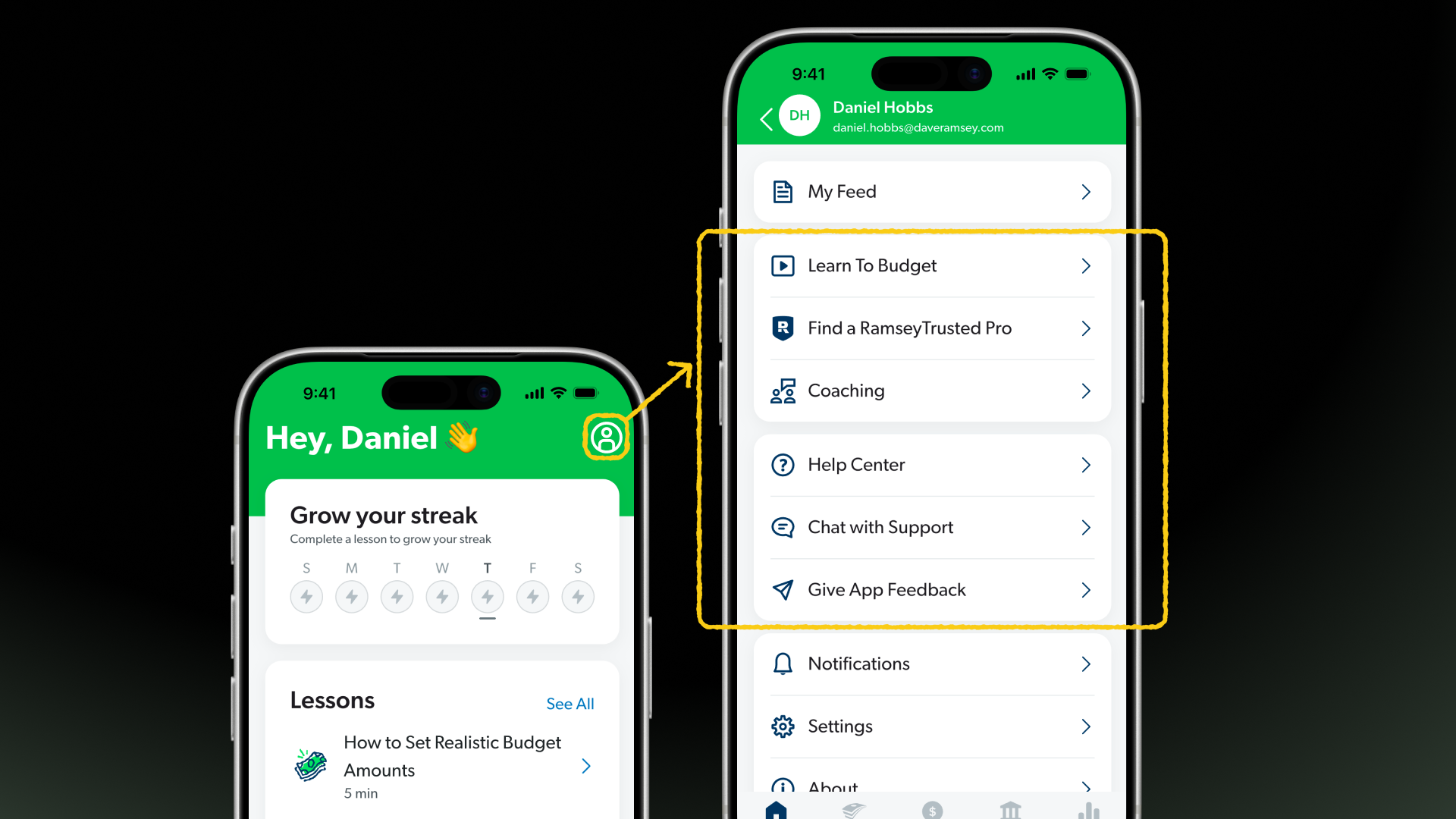
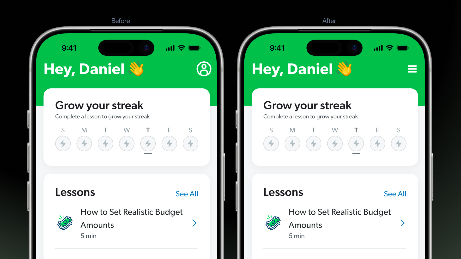
Users knew help existed but couldn't get to it. The help section was buried behind a profile icon that most users read as an account menu, not a help entry point.
The navigation wasn't telling the truth
The profile icon was communicating one thing but hiding something much broader underneath it. Users had no reason to look there for help.
Support tickets were piling up
Users who couldn't find help on their own were ending up in the support queue for problems that could have been self-served.
Opportunity
EveryDollar users were getting stuck early. New users would sign up, hit friction in the first few sessions, and not know where to turn. Support tickets, weekly user calls, and Mixpanel behavioral data helped us map where the drop-off was happening and why. Getting users to help quickly became the first problem to solve.
Goals/Deliverables
Get users to help faster.
Reduce the friction between a user hitting a wall and finding the answer they need.
Fix the navigation honestly.
Redesign the entry point so it accurately communicates what lives underneath it.
Measure the impact.
Use Mixpanel behavioral data to confirm the fix was working and monitor for unintended consequences.
Desired Outcome
To make help genuinely accessible to EveryDollar users by fixing the navigation entry point that was quietly sending them in the wrong direction. A small, well-diagnosed change that reduced support burden, kept users moving, and proved that the right fix doesn't always have to be the biggest one.
My Approach
The first instinct was to improve the help content itself, but the data said users weren't getting there at all, so that would have solved the wrong problem. I mapped out a few directions for getting users to help more reliably before landing on a targeted navigation fix. It was a small change, but the kind that required confidence in the diagnosis.
The Work
I worked closely with my PM and engineer to ship it and stay close to the data afterward, making sure the fix wasn't creating new issues elsewhere. It also took some internal advocacy to get stakeholders on board with prioritizing what looked like a minor UI tweak.
The Outcome
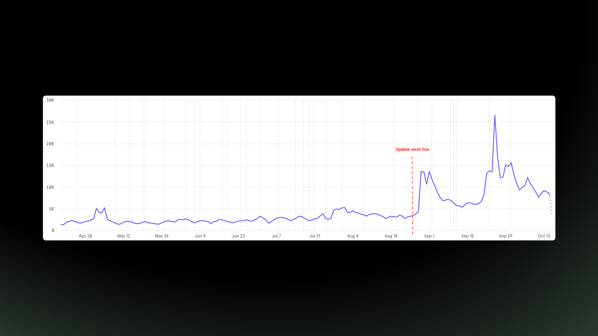
Users who were getting stuck early now had a clear place to turn. A 24% lift in help section discoverability, measured through Mixpanel behavioral data, confirmed the fix was working. Of the approaches we explored, this navigation change was the lowest risk and fastest to ship, and it turned out to be the right call. It has stuck ever since and continues to support retention as the team works toward deeper improvements down the road.